Our professional Logo Design Agency in Sheffield UK will improve your brand awareness to its best.
At the point when it’s the ideal opportunity for a logo design creation, you’re probably going to investigate every one of your options. Do you pick a fresh out of the plastic new direction for your image, or change the logo design you have as of now? Whatever you conclude, you might be questioning: what makes an extraordinary logo design? How would you make a logo to catch the pith of your item, person or brand?
Your logo is you or your business’ first resource with the rest of the world. If people connect with your marking, the probability is they’ll be more open to whatever it is offering them. Incredible logo design requires an unpredictable combination of design abilities, innovative hypothesis and skilful application.
Professional Logo Design Services
Before beginning any design work we will set aside the effort to learn and comprehend your business story, objectives and target crowd. From this, we will make an exhaustive arrangement of objectives. These are our 5 stage logo design interaction to guarantee the result looks great as well as performs for your business as well.
– Business Research
– Objectives Creation
– Marketing Ideas and Designs
– Introducing Ideas
– Logo Creation
UK Logo Designer Agency
Avant Digital is a visual design agency with more than 10 years of experience. We have in our portfolio companies going from new businesses to huge corporates. We offer our logo design insight to business visionaries and new companies who need another personality. We likewise offer a logo redesign service for developing businesses that wish to take their image personality to the following level.
We will introduce numerous options depending on the destinations settled upon, which will be given supporting symbolism so you can envision how the logo will glance, all things considered. Avant Digital Agency puts forth an attempt to introduce the best design creation openings, from the decision of type through to the shadings utilized, giving you a recognizable gadget for your brand name that will perform.
Why us for your Brand Creation?
The logo design made for your business must stand apart yet to turn into an ageless expression of your business personality. This will permit you to have an image that will effectively impart, draw in with, and hold your crowd more viable than previously.
Once the logo is finished, the design will be given to you in various forms. This incorporates vector records (EPS, SVG and PDF) and well as raster designs (JPEG and PNG). Along with this, a supporting utilization report will be incorporated. In contrast to certain companies, you will likewise claim full copyright to your design.
Pick a Professional Logo Design Agency
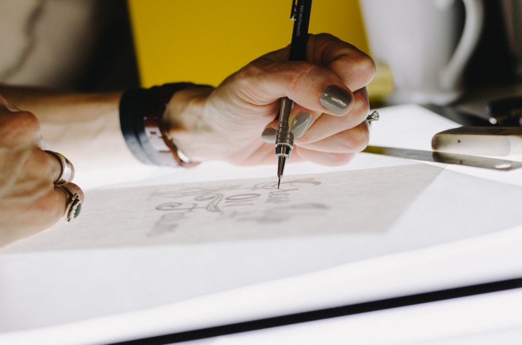
In contrast to numerous logo designers, we set aside the effort to learn and comprehend the business story, its mission, vision, and target crowd. From this, we make a rundown of objectives that the new character needs to meet. During the design stage, utilizing the objectives as a source of perspective we will utilize mind-planning and visual conceptualizing procedures to investigate various thoughts and directions for your logo. Beginning with pencil and paper, we will draw various logo concepts before chipping away at a PC to make adaptable vector craftsmanship utilizing professional design software.
By utilizing vector software, we make versatile craftsmanship that can be effortlessly repeated at any size with no deficiency of quality. This implies you will have professional, excellent outcomes each time regardless of what size your logo should be.


Professional Brand Design
Following a deliberately created character design measure, Avant Digital Agency can meet key objectives, which not just assists you with choosing the most appropriate design for your business yet additionally guarantees that the logo design will be a triumph.
Brand design can come in numerous shapes and structures, from basic logotype based logos to monograms and images or identifications. We offer to prompt you on the best methodology dependent on your industry, objectives and target crowd.
In case you’re intrigued to work with Avant Digital Agency on your logo design or brand awareness, yet additionally, on website design, SEO, PPC, and social media marketing, utilize the online quotation form.
Our work as designers is to distil the substance of a brand into the shape and shading that is destined to suffer because visual appearance has a basic influence in framing a connection in our cerebrums between what we experience and who we experience it with (the brand). In numerous regards, a company’s logo is similar to our friends and family’s appearances.
At the point when the correct logo is lined up with a phenomenal item, and when it’s set up for a lot of time, it can in the end turn into a precious resource for any company. The Nike swoosh, McDonald’s brilliant curves, the Michelin man, Mercedes’ three-pointed star, the Woolmark image – these are only a couple of the more prominent models. However, other than their universal nature, how would you give a logo the most ideal possibility of arriving at a comparative status? There are widespread attributes inside each effective logo project, and I’ve illustrated some here to help improve the quality of the imprints you make.
The system is turning into an inexorably significant piece of the marking interaction. What this implies practically speaking will often rely upon the size of the task, however, everything begins with posing the correct inquiries.
Michael Johnson’s book Marking: In Five and a Half Advances is committed to Johnson Banks’ inventive interaction, and covers complex difficulties, for example, defining the brand system indefinitely in more detail than we might like to hear.
In it, Johnson advocates requesting the accompanying six things from the brand you’re dealing with as a beginning stage:
– What are we doing here?
– What do we do, and how would we do it?
– What makes us extraordinary?
– Who are we here for?
– What do we esteem the most?
– What’s our personality?
The alleged ‘retro marking’ development was commenced by North’s quite praised rebrand of Center, which revived its unique 1960s imprint and won one of PC Expressions magazine’s pined for Brand Effect Grants in 2016 all the while.
NatWest and Kodak followed inside a couple of months, and we’ve seen endless models since. Brands should be careful about getting on board with the bandwagon for it, yet where authentic legacy and undiscovered likely exists in an imprint, try not to discard the good along with the bad and consider carrying it to the front – see our recommendation on the best way to stir a brand’s legacy.
“It’s essential to put your inner self aside and not excuse designs made by others – and in doing so consider evolution just as revolution,” contended North prime supporter Stephen Gilmore in a paper in PC Expressions.
Sans serif fonts have ruled logo design lately, often going inseparably with the moderate development – models incorporate Pentagram’s prominent rebrands for Windows, MasterCard and the College of Human expressions London.
In 2015, Google broadly traded its longstanding serif logotype for a lot more amicable, more contemporary sans serif. Be that as it may, don’t allow patterns to cloud your judgment: a serif font could, in any case, be the correct decision for your most recent venture, especially on the off chance that you need a trendy and lavish or traditional and professional feel, so set aside the effort to research your options.
On the off chance that you utilize a current typeface in a logotype, especially a close omnipresent one like Helvetica, there is often more tension on other touchpoints, like symbolism, shading range, tone of voice, etc, to create and improve the brand’s personality.
Skilful following and kerning are fundamental when setting a straightforward logotype in a current typeface. Wide-followed types can feel refined and legitimate, while tight, careful kerning can help lock individual letterforms together as independent units.
Once in logotype structure, tweaking and changing the typeface can likewise smooth links between letterforms, or add an exceptional bend to fit the tone of the brand – one model would shear off letter terminals at coordinating with points to give a sharp, reformist feel.
Here and there a current typeface just won’t cut it, and a hand-drawn typographic treatment feels a whole lot more suitable for the brand. Maybe the most iconic model, which has developed step by step over a century, is Coca-Cola.
Contrasted and its savage opponent Pepsi, which has experienced in any event seven significant iterations, the market leader sports a lot of a similar logo as it did in the last part of the 1800s. On the off chance that Coca-Cola had dumped that recognizable scribbling content for a sans serif, similar to Pepsi did during the 1960s, there would have been the commotion. The fact of the matter is basic: get an exceptional, exclusively shown type right on target and you’ve got yourself some incredible brand recognition with certified longevity. (Even though as a last resort, these free penmanship fonts are extraordinary options).
Monograms don’t need to be limited to robes and wedding invitations, and when given the correct treatment, company initials shaped into a typographic lockup can make for a straightforward however viable insignia for a brand.
This is quite evident in the fashion area – Coco Chanel’s interlocking Cs and Yves St Laurent’s dollar sign-Esque lockup being champion models. Likewise, see our best 3-letter logos for different imprints that consolidate characters successfully.
Now and then even the easiest typesetting can uncover fortunate ‘mishaps’ that, grown appropriately, can lead to bits of a virtuoso. One exemplary model is Landor’s FedEx mark, the secret bolt between the ‘e’ and the ‘x’ making a generally plain sans-serif logotype the toast of logo design pundits the world over.
Give composting a shot of the brand name in various typefaces and maybe a comparative cheerful mishap could happen in your work. See our post on logo Easter eggs you may have missed for additional instances of covered up messages in logos.
On the off chance that your customer can manage the cost of it, working with an expert bespoke sort design agency, for example, Dalton Maag or Fontsmith to build up a completely marked typeface family can put typography front and focus on a brand’s personality, rising above the logotype and penetrating all brand communications.
Between them, these two agencies have worked for a variety of brands including Nokia, Rich, Rio 2016, Sainsbury’s, ITV and Lloyds. “Type characterizes the tone of voice of a brand by its emotional characteristics,” Dalton Maag organizer Bruno Maag disclosed to PC Expressions in the video meet underneath.
There are sure ‘cut craftsmanship’ style visual prosaisms ensured to make any logo design master snap their teeth. Keep away from common offenders like lights to address ‘thoughts’ or globes as shorthand for ‘international’ no matter what.
Be that as it may, shape brain research goes a long way beyond the self-evident. Often utilized as an image of the colossally compelling Bauhaus School of Design are the yellow triangle, red square and blue circle – the result of research by Wassily Kandinsky, who contended that shape and shading can rise above social and language boundaries.
Kandinsky contended that splendid, zingy yellow supplements the rakish sharpness of a triangle; cool, profound blue is an ideal counterpart for a circle; while a hearty, instinctive red accomplice pleasantly with a square. We’ll investigate the shading hypothesis in a smidgen more detail later on.
It’s getting progressively common for design agencies to air their sketchbooks out in the open, regardless of whether on online stages like Behance or Spill or as a feature of undertaking contextual analyses of their websites or delivered to the design press.
Often these operations incorporate the specialized side of a design’s composition, uncovering and examining the network that underlies its construction and the particular bends and points that characterize the shape.
Such undertakings can be significant reference focuses to educate your work and can help make unique design standards, for example, the brilliant proportion wakes up in the application.
Large numbers of the shading harmonies above require cautious administration to be fruitful in a logo design, and tones often shouldn’t be utilized in equivalent amounts.
Correlative tones can be too serious whenever utilized unreasonably, for example, while comparable to plans have the opposite issue: they are delicate and satisfying to the eye, however ailing in contrast – and you should choose a predominant tone, utilizing the others as to help and complement colours only.
Triadic plans are significantly more energetic, however again pick one predominant shade of the three. For fledgelings, it’s often most secure to settle on a split-integral plan as there’s a decent common equilibrium of contrast and harmony.
Your decision of the shading range can represent the moment of truth of a logo design, somewhat for basic stylish reasons, yet additionally due to the mental associations of tones – which we addressed momentarily as a feature of the Bauhaus hypothesis on the past page.
On a straightforward level, colours on the warm side of the range – like red and yellow – are striking, inspiring and vigorous, while their cooler partners, blue and green, radiate tranquillity and feel more saved.
This is especially pertinent with regards to marking: on an emotional level, as far as how consumers feel when they take a gander at it; yet besides reasonably speaking, as far as market champions.
After so much discussion of shading, it’s not difficult to fail to remember that a portion of the world’s most iconic logo designs are monochrome and utilize the glaring difference that this range bears.
Regardless of whether your essential logo design is in heavenly technicolour, it needs to work adequately in high contrast for various applications.
If your logo design utilizes shading to convey importance, consider how you can mirror that significance when the tone is eliminated. At times this may mean changing the contrast between various components of your design with the goal that they convey significance when repeated in monotone.
Don’t disparage the estimation of a second (or third) pair of eyes to recognize things that you may have missed during the design stage. Once you’ve stirred up your logo design concept, consistently set aside the effort to detect check it for unexpected social misconceptions, insinuations, grievous shapes and covered up words and implications (see our logo design falls flat for additional models).
Many design studios advocate sticking work-in-progress up on the dividers to empower constant companion audit, yet if you’re an alone consultant, attempt to track down some confided in friends to get an eyeful of an eye over your work – and return the courtesy.
A logo design is only one little component of a marketing plan – and ought to be created coupled with other activation focuses as a feature of a more extensive ‘brand world’.
This term is basic to the marking cycle at London agency SomeOne. Also, as fellow benefactor Simon Manchipp sets out in the video meet with PC Expressions over, it’s vastly improved to accomplish rationality between unexpected components in comparison to just consistency.
Intensive brand use aides should cover everything from shading options, to a base and greatest sizes at which logo designs ought to be utilized, positioning guidelines, dispersing – including exclusion zones from other design components – and any clear no-nos, like extending or twisting. See our #1 style advisers perceive how it’s done.
A few agencies depend on them to guarantee a smooth, consistent handover to a customer’s in-house group; others feel they can be excessively prohibitive and prescriptive.
In the course of the most recent couple of years, web-based media has gotten more pervasive, and each man and his canine has built up an opinion about design. In like manner, this last point has created from an occasional inconvenience into something that anyone dealing with a generally prominent rebranding activity should remember.
10 brilliant standards of logo design
At the point when you think about a person who’s affected your life, it’s practically sure that you can picture what the individual in question resembles. Thus it is with the brands from which we often purchase. We can without much of a stretch picture the logo just by pondering our encounters with the item, company or service.
Where there was once a small bunch of companies working inside a specific market or speciality, there may now be hundreds, perhaps thousands, all looking for attention, all needing us to take a gander at them first. That makes an expanding need for brands to outwardly separate themselves so they’re not confused with contenders.
That differentiation is accomplished through brand character design – a scope of components that all work together to frame a particular picture in our psyches. Contingent upon the company, the character can incorporate regalia, vehicle illustrations, business cards, item bundling, photographic style, coffee cups, announcement promoting, and a pile of different things, directly down to the font decision on the website.
One of the most fascinating pieces of being a designer is that you will learn new things with each new venture. Each customer is unique, and surprisingly in a similar profession, individuals manage their responsibilities from numerous points of view.
To make it simpler for consensus to be reached on your design thought, you need to ask your customer the correct inquiries from the start: What are you doing here? What do you do, and how would you do it? What makes you extraordinary? Who are you here for? What do you esteem the most?
Those questions may appear to be very direct, yet they can be trying to reply, and they’ll lead to additional questions about your customers’ businesses. What you find in this period of an undertaking will assist with deciding the strongest conceivable design direction.
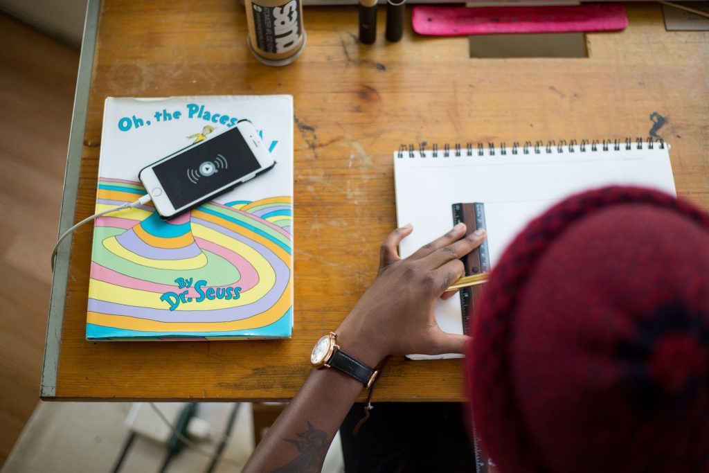
Utilizing a sketchpad is an opportunity to rest our eyes from the glare of splendidly lit pixels that will in general rule our lives. Yet, more critically, recording distinctive design thoughts can be a lot speedier when there is not a digital gadget between our hands and our cerebrums. So if you wake in the night with a thought you don’t have any desire to lose, the pen and paper by your bed is the ideal method to recollect. Outlining likewise makes it simpler to put shapes precisely where you need them – there’ll consistently be an ideal opportunity to digitize your imprints later (see our drawing tips for additional portraying counsel).
At the point when you’re depicting design thoughts to customers, before digitizing an imprint, it tends to be useful to share a sketch or two, making it simpler for them to picture the result without distraction from typefaces and tones. Don’t share excessively, however – only the best thoughts.
Leaving tone until close to the end assists you with concentrating on the essentials of the thought as opposed to something a lot simpler to change. A helpless thought can’t be saved by an intriguing range, while a smart thought will, in any case, be acceptable, paying little mind to shade. Picture a notable image. Consider it now. It’s the structure we recollect before the range. It’s the lines, the shapes, the thought, regardless of whether that is the chomp from an apple, three equal stripes, four linked circles in a horizontal line, or something different.
An imprint should be significant for the thoughts and exercises it addresses. A rich typeface will suit a very good quality eatery more than it will a kids’ nursery. A range of fluorescent pink and yellow won’t assist your message withdrawing in male pensioners.
Creating an imprint that bears some similarity to an insignia, paying little mind to industry, won’t work. You know these things. They’re self-evident. Be that as it may, it goes somewhat more profound. The more proper your rationale behind a specific design, the simpler it becomes to offer the plan to a customer. Furthermore, that can often be the most difficult piece of a venture. Designers don’t simply design. They sell, as well.
Effortlessness helps recognition, particularly when such countless brands are seeking our attention. You need to permit onlookers to review an imprint after a look, and that is unrealistic with an excessively itemized design. A brand name must be centred around the concept – have a solitary ‘story’ – and much of the time should be straightforward in structure. This is because it needs to work in an assortment of sizes and scope of applications, from a website icon in a program bar to signage on a building.
At the point when your customers’ rivals are altogether utilizing a specific typographic style, or a similar sort of range or an image put on the left of the brand name, accomplish something else. It gives you the ideal chance to separate your customers instead of having them mix in.
Be that as it may, such a lot of closeness in the commercial centre doesn’t mean your work has become simpler because it takes a valiant customer to avoid the pattern. By showing imagination in your portfolio, you’re on your approach to pulling in the sort of customer you need.
It’s uncommon when you see a logo in isolation, on its own without the context of a website or business card or beverages menu or application icon. That is the reason a customer presentation needs to incorporate an assortment of significant touchpoints to show how a logo shows up when seen by expected clients. It’s similar to when you’re trapped in a hopeless cycle – it can assist with venturing back, to take a gander at the master plan, to see where you are, what you’re encircled by.
In design terms, the master plan is each potential thing on which a customer logo may show up. Be that as it may, consistently consider how the character works when the logo isn’t shown in the light of the fact that while significant, an image will only take a personality up until this point. One approach to accomplish durable visuals is to make a bespoke typeface that is utilized in the logo but on the other hand that is found in marketing features.
A logo doesn’t need to show what the company does, indeed, it’s better if it doesn’t, because the more unique the imprint, the more seriously suffering it can turn into. Verifiably you’d show your production line, or perhaps a heraldic peak on the off chance that it was a family-run business, yet images don’t show what you do. All things being equal, they clarify what your identity is. The importance according to people in general gets added a short time later when associations can be framed between what the company does and the shape and shade of its imprint.
Often a bespoke wordmark will do the work, particularly when the company name is one of a kind, like Google, Mobil, or Pirelli. In any case, a version of the logo that works in little confines will consistently help. That may be pretty much as basic as lifting a letter from the name and utilizing a similar tone, or it may consolidate an image that can be utilized as a secondary design component (wordmark first, image second) rather than as a logo lockup where the two pieces appear alongside one another.
Don’t be enticed to exaggerate the design style because the attention is on the letters. Decipherability is key with any wordmark, and your presentations ought to demonstrate how your designs work at all sizes, huge and little.
Infusing some mind into the work won’t only make your work more fun, however, it can assist your customer with getting more fruitful, as well. It won’t be proper for each profession, like weapons producers and tobacco firms, however, whether you decide to work with those companies is something else. To some degree less contentious law and monetary areas are loaded up with companies distinguished by stodgy and sterile marking, placing some humour into the personality of such customers is one approach to separate them.
There’s an equilibrium, however. Take it excessively far and you hazard distancing expected clients. However, paying little mind to the company, individuals work with individuals, so a human, emotional side to your work will consistently have a degree of pertinence.
Logo Design Agency Sheffield UK - Avant Digital